Design Your Own Dashboards in netTerrain DCIM
Having all of the network infrastructure documentation in one system isn’t necessarily the goal: we also want to get insight from the data, learn more about how the data is aggregated, and maybe take action.
Normally, these insights have been presented in the form of reports, which can take the form of a collection of widgets that can be accessed from a variety of dashboards. We’ll look at how simple it is to develop custom dashboards in netTerrain in this blog.
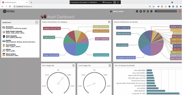
By double-clicking on a node, a property, or a shown field, you can quickly access table views. There are various approaches to combine data and derive conclusions from your data center and network data in netTerrain.
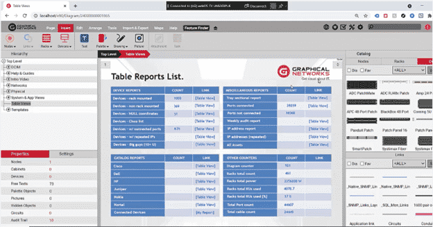
Many of these reports are already preset reports in Graphical Networks’ technology (we have over 100 table views and 200 expressions, or ‘aggregate functions,’ as we call them); we also have roughly six or seven dashboards, each with a variety of elements.
The reality is that consumers always demand new or different reports, which is why, as part of our maintenance, we will develop reports for you at no additional cost. We also provide you the key to making these reports manually, so you wouldn’t have to file a ticket for us to do it for you.
Let’s jump in with table views.
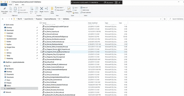
Table views are simple to create: typically, a table view is created by placing a SQL file in a subdirectory called “SQL tables” on the netTerrain server. As you can see below, we already have a handful of them pre-defined
The accompanying sample, which is a summary or column view of all the stackable devices with certain characteristics, is essentially just a SQL query, as you can see.
Let’s look at our second reporting engine, which we refer to as reports or dashboards. This is more sophisticated because the data is presented in a graphical format, which is known as a business intelligence engine or a business intelligence (BI) tool.
We provide the tools for you to build these reports yourself, and you may completely personalize them.

Let’s take a look at some of the components of our dashboard, often known as a business intelligence (BI) reporting engine.
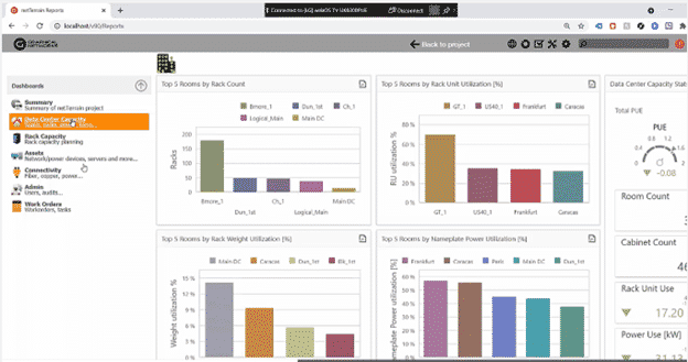
The dashboards are first on the left. The arrow (which you can see in the movie or in the image below) indicates that you can construct many dashboards and sections, so you may have multiple dashboard sections, each with an arrow to expand and collapse it and their own set of dashboards. You can access the widgets that make up each of these dashboards by clicking on one of them.

It’s a shelf asset report or a network infrastructure capacity report in this case, both of which have several widgets. Bar graphs, pie graphs, time series, speedometers, and maps are examples of widgets, however there are charts, pivot tables, and even basic tags that combine a scale or function.
How do you make these dashboards or customize them? We’ve included a tool called the netTerrain dashboard editor in the netTerrain server.
The most common method is to open an existing dashboard and then modify it…this is probably the simplest method. You can, however, build a dashboard from the ground up if you’re so motivated.
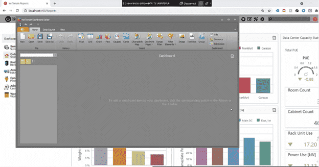
To begin developing a dashboard from scratch, you must first establish a new source of data. We’ll construct a handful of reports as an example. “Top10DeviceUsage” will be one of them.
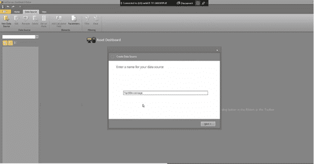
You start by implementing a data source—if you’re importing data from netTerrain, you’ll link to the netTerrain preset string. You may use this BI tool to connect to nearly any database in your company because netTerrain offers a variety of backend engines to choose from.

The netTerrain tool offers visual drag-and-drop graphical user interface (GUI) that allows you design queries. It’s a raw data extraction because the data can be extracted directly from a table (or you can use the GUI to create your query using joints, etc. on the fly). Do you already have the SQL expression? Just paste it and preview the results. In this example, the top ten device kinds by usage are as follows:
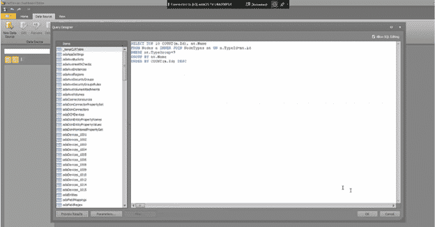
Again, you can simply ask us these questions. So now that we have the data source, the next step will be to choose a widget to use on the dashboard. We’ll make a chart because this is the top 10 device usage report.
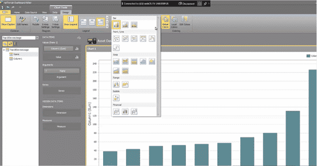
Then, using drag-and-drop, place the corresponding columns into the values and arguments data items on the dashboard. I won’t go over the entire process today, but you can modify a lot of things, including sorting, inverting sorting, changing colors, changing the names of the X and Y axes, transposing data, adding filters, and so on.
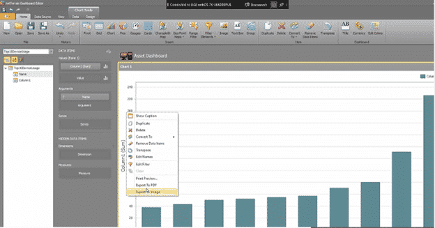
The bar chart is only one example of what you can do with these widgets. Change the chart’s appearance to a line, trend line, financial, ranges, and more by going to “Design.” There are a variety of functions that you can use.
So, now I’ll establish another data source: for this example, a pie that shows me the devices by a status value. Create a data source, use the default connection string, and insert the SQL expression. Preview the data, and we’ll see that we have some information about different devices by status (it doesn’t matter what the data is because this is just an example).
After that, I’ll add a pie. The identical thing will happen this time: I’ll enter the values and parameters. We now have a pie chart for which we can adjust the design in many ways, change the colors, change the data labels that I’m showing, change the tooltips that I’m showing, and so on.
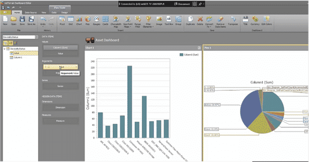
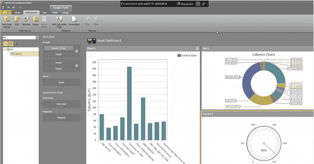
You may modify the positioning — vertical, horizontal, basically how the real estate is set out — as you start adding these widgets. There are gauges and several other components. So, let’s say we need a rack count: we can get that from another data source. It’s simple to do.

In a nutshell, here is how you use netTerrain’s dashboard designer to organize your dashboards and widgets. Just to reiterate, you may have our staff produce dashboards and reports for you (this is included in your maintenance contract as soon as you sign up, so you don’t have to do it yourself if you don’t want to). You simply request them from Graphical Networks, describe which widgets you require and how you want them to appear, and that’s all there is to it.
In sum, netTerrain’s dashboard designer is an easy tool to use — especially if you have a staff member that knows a thing or two about reporting, especially BI, and SQL.
To discover more about how netTerrain DCIM may assist you in resolving your IT issues.
Please contact Trinity IT Consulting for further information or Sign up for free 14 Day Trial.
